Veilance Nomin First Impressions
After reading my Arc’teryx Granville 16 review, a reader offered to send me a Veilance Nomin. And he did. He sent me one just before the end of the year. I wanted to use the bag a couple of weeks before writing my initial impressions of it, and here we are.
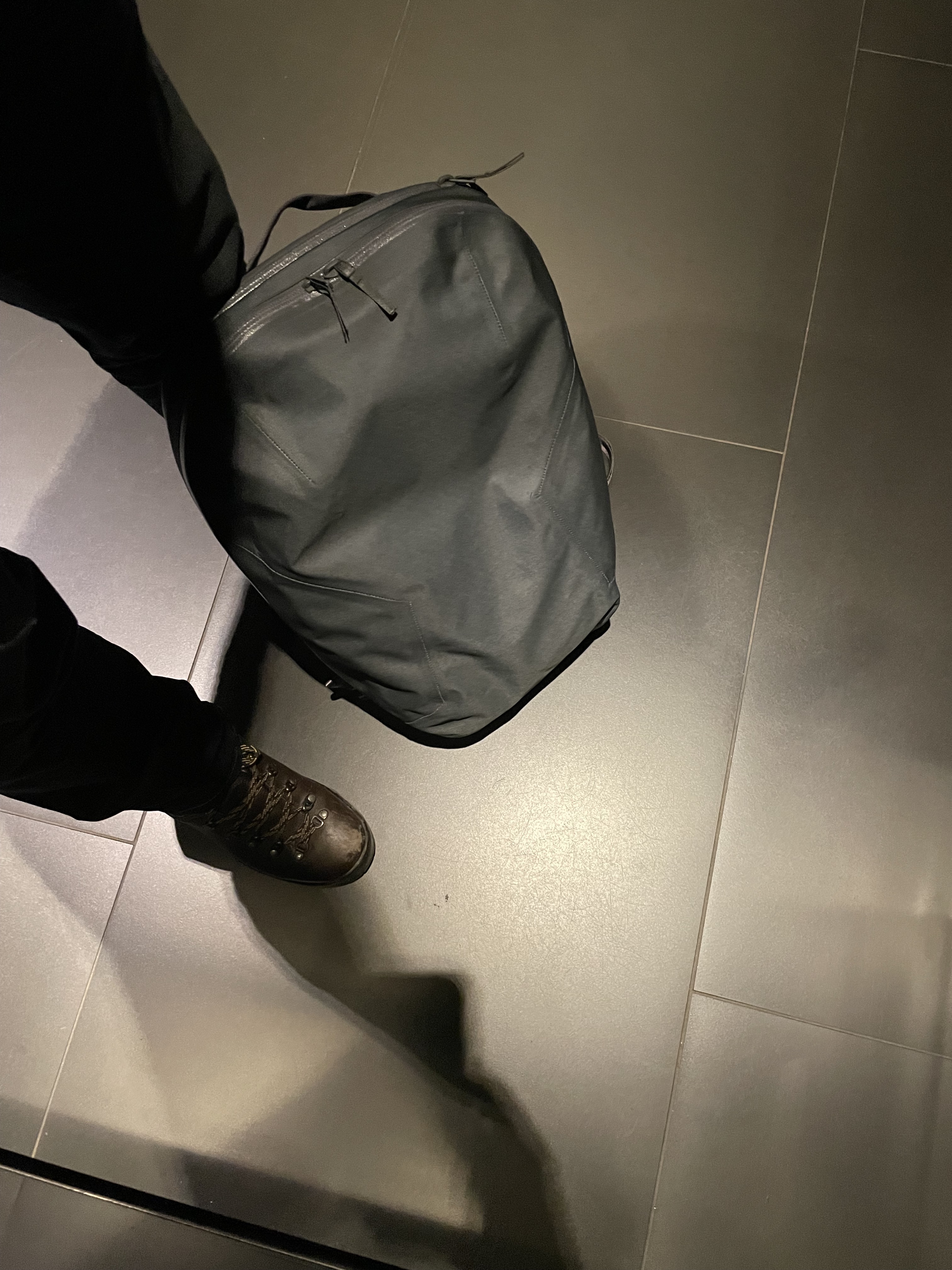
The Nomin is completely unassuming. No shiny materials, no logos, utilitarian shape, and no unnecessary features. It’s, aesthetically speaking, the perfect bag for an urban commuter.
The initial impression is that the Nomin is a backpack that came from the future. Seriously, the way it looks and feels, and taking the fabric into account, this is a backpack that probably feels more at home in a SciFi world like The Expanse, or in the back of an astronaut than on a commuter traveling to work. That, right there, is what makes this backpack so awesome when you first see it.
The pack is super light, and extremely weather resistant. The fabric (AC2 Nylon) is tough and quiet. I like the quiet part, which is one of the things that was bothering me from the Granville (the fabric makes noises when you move). However, one point to mention is that since the fabric is so slick, and the external features so minimal, it's sometimes difficult to grab the fabric in order to help open the zippers. On cold days this becomes more of an issue, since cold fingers and cold fabric make for an uber slick combination. I learned to grab one of the zipper pulls and use it as leverage to open the other one. I know veilance was going for no external ornaments or features, but maybe a couple of subtle and small grab tabs or pieces of webbing strategically placed would solve this issue. Maybe on V3 they will make it better (this is the V2 pack, the second iteration of Nomin).
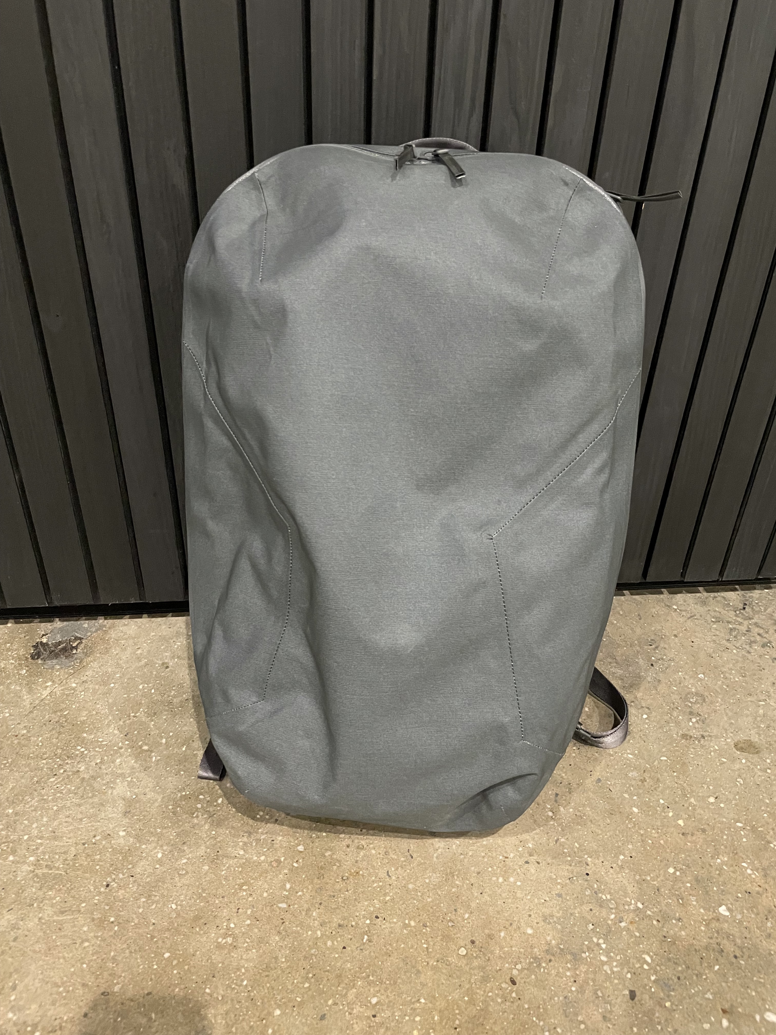
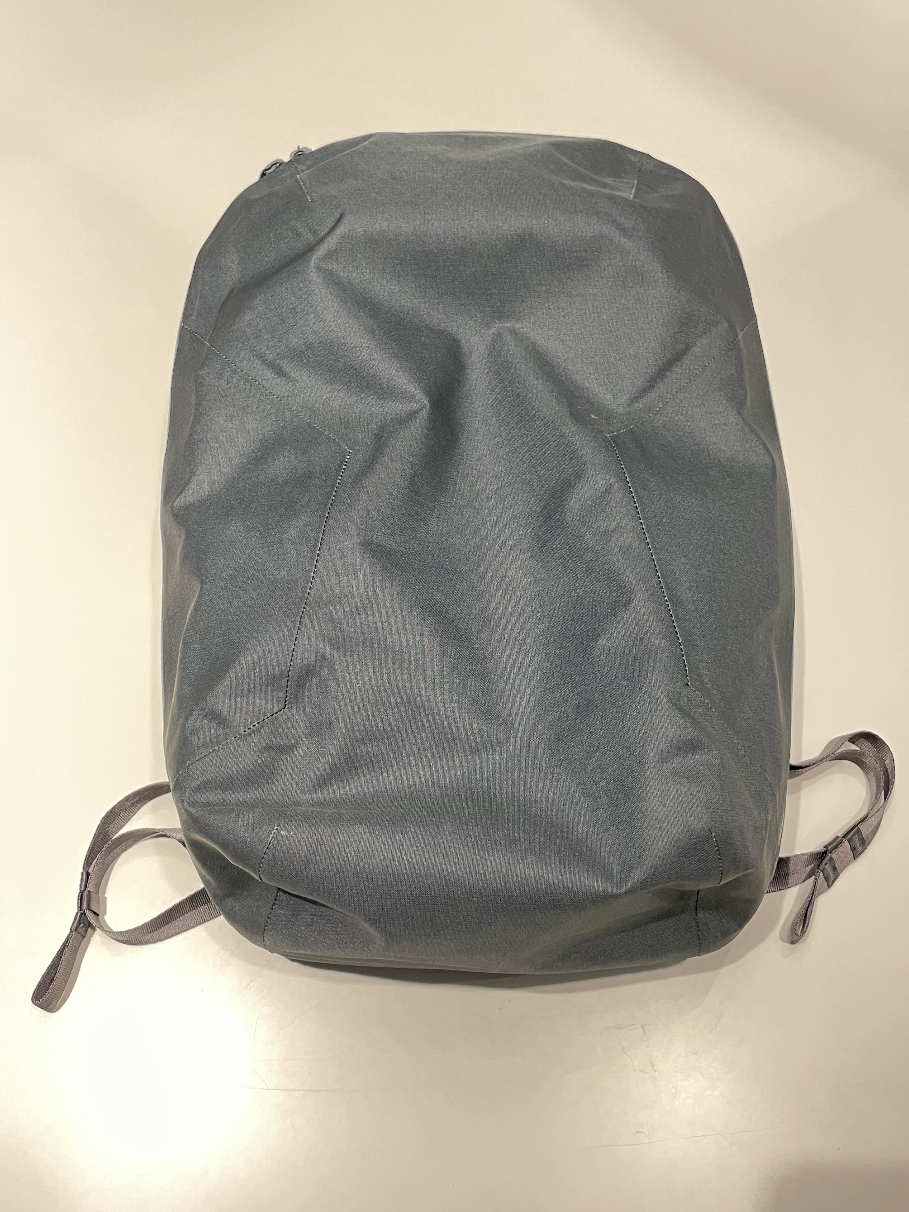
This pack was designed with ultra-minimalism in mind. Low profile and no signature are the name of the game with this pack. The outside is completely sleek, except for the zippers and a very spartan handle. The seam lines are visible, but they are done in a way that they just blend in with the rest of the pack.
There are two zippers, one for the main compartment, and one for the laptop compartment. This last one seats closer to your back, and the zipper that opens serves two purposes: to open the top external accessible pocket, and to open the side-entry laptop compartment.
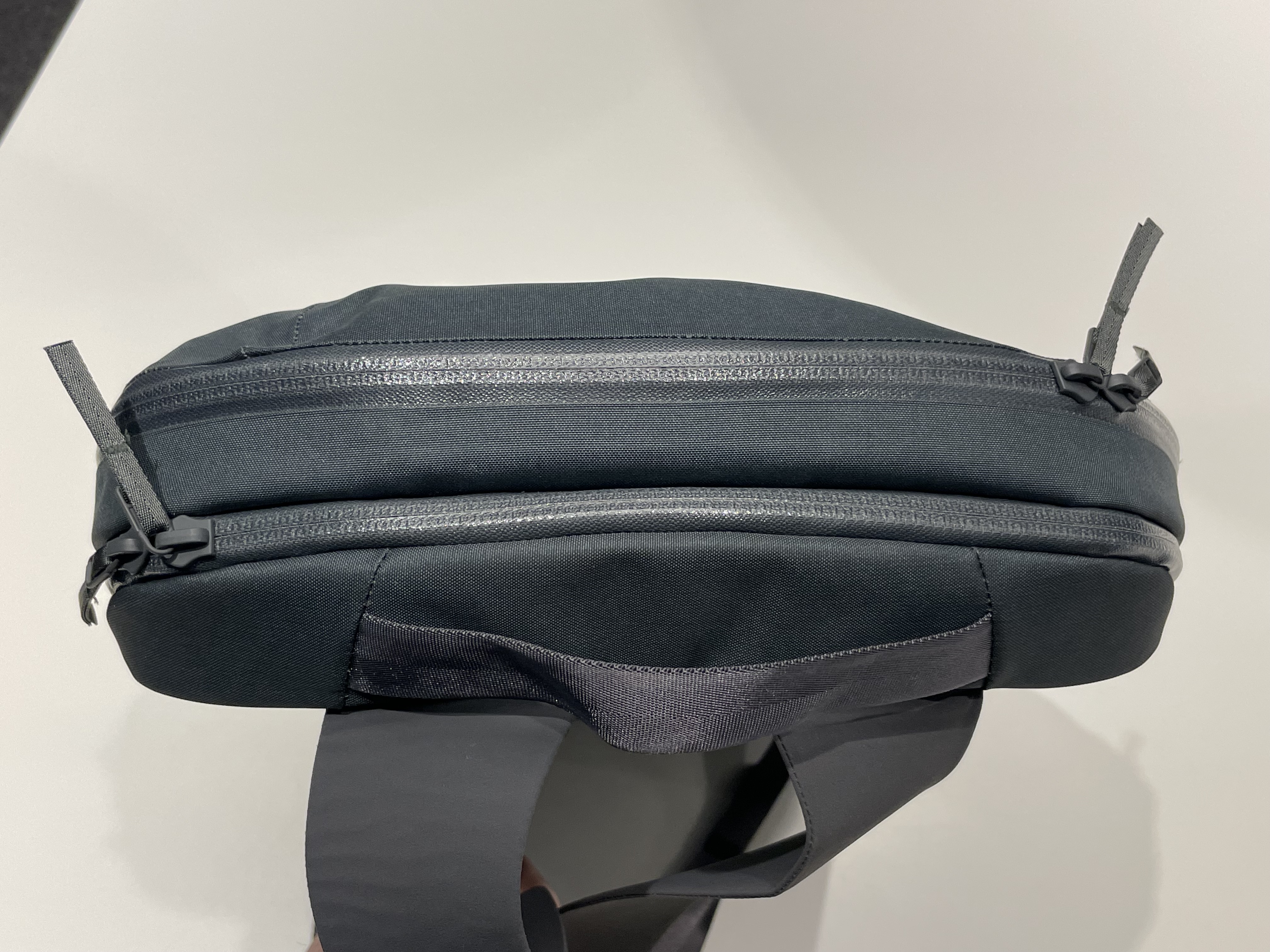
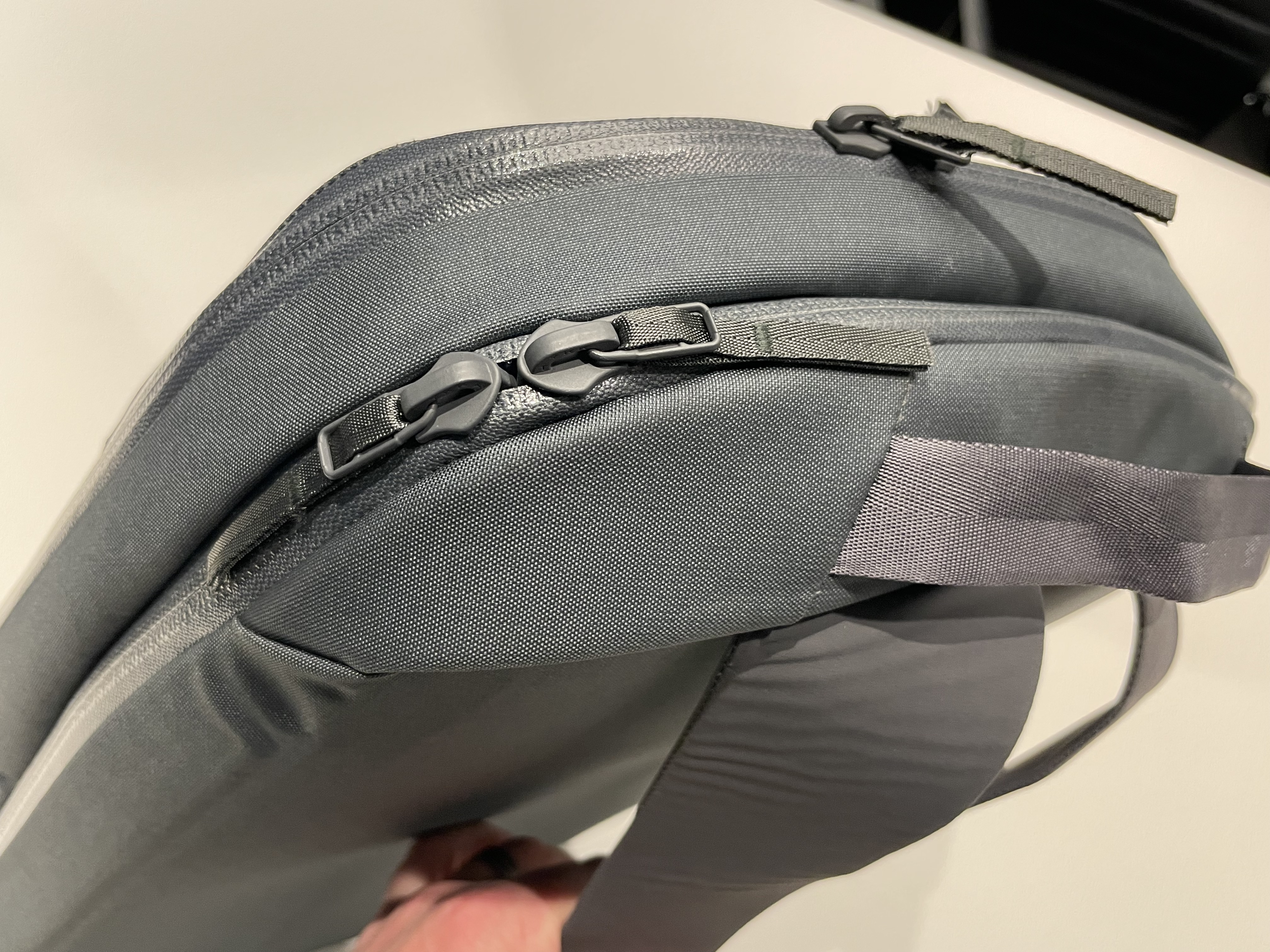
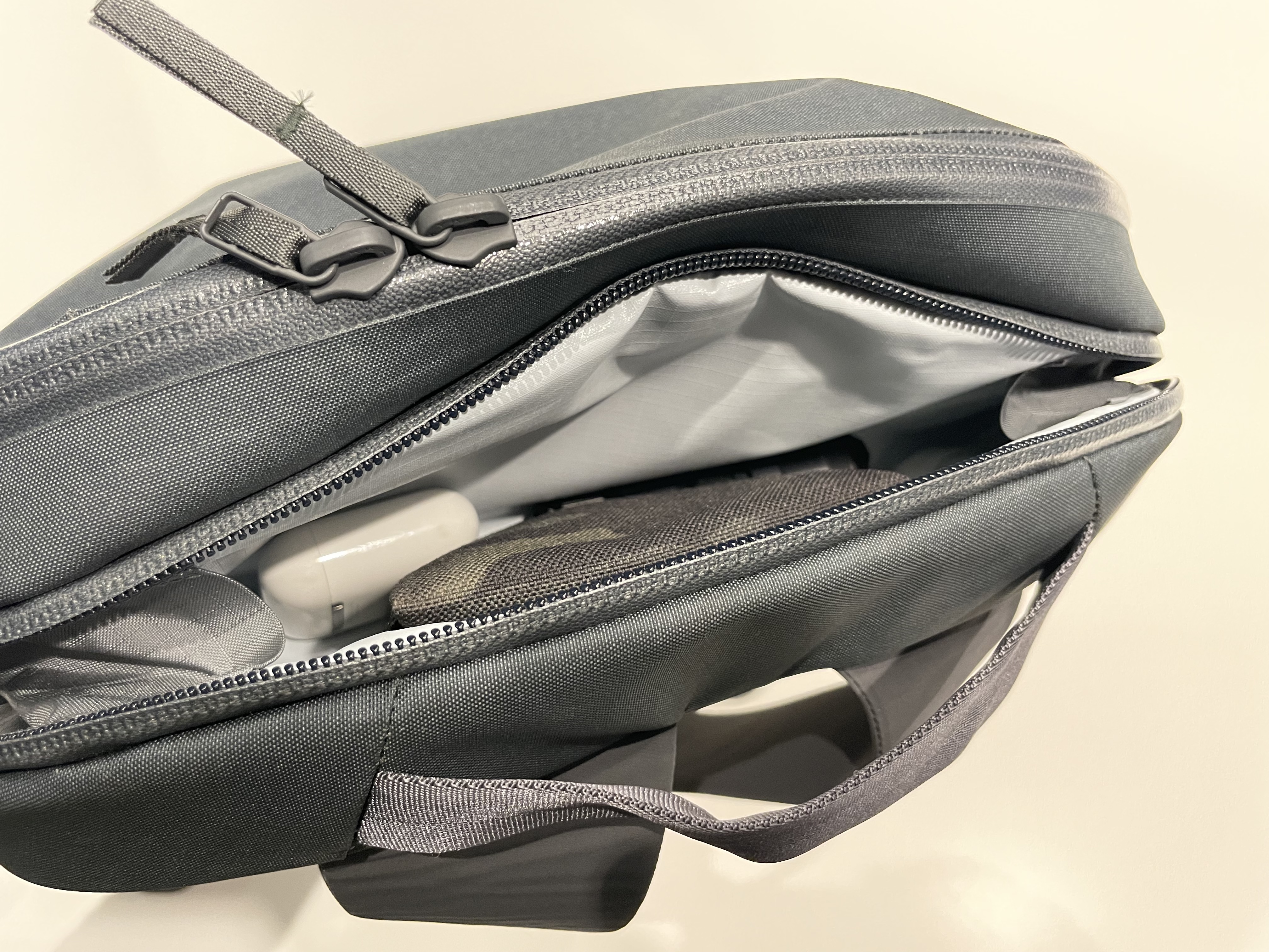
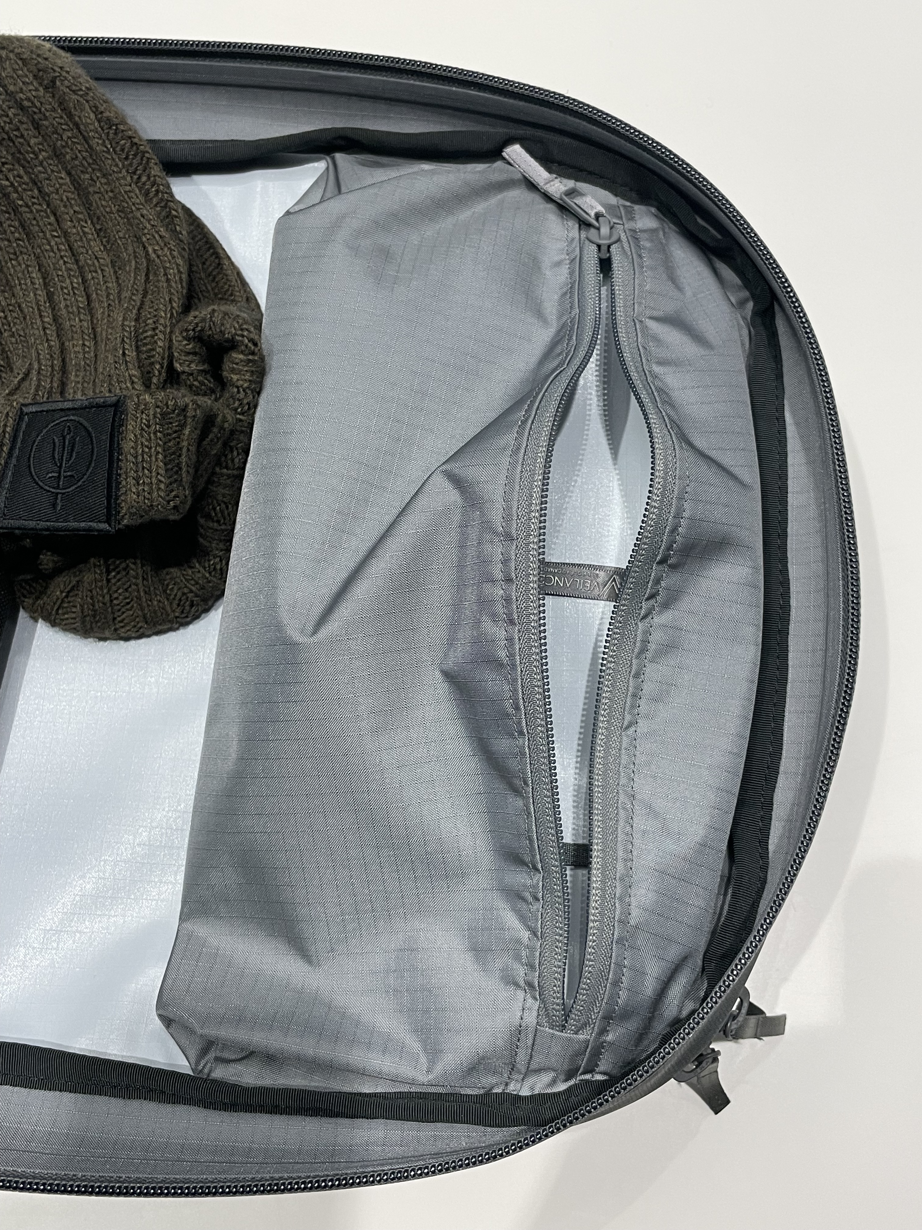
One thing that is driving me crazy is the fact that the same zipper opens the top pocket and the laptop compartment. The laptop compartment is accessed from the side, so you need to tilt the backpack horizontally to be able to get to it when you open it all the way. If you happen to have the other pull of the zipper opened all the way, accessing the top pocket, then things there tend to fall out. I don’t know how the designers at Veilance didn’t catch this issue, but it’s annoying.
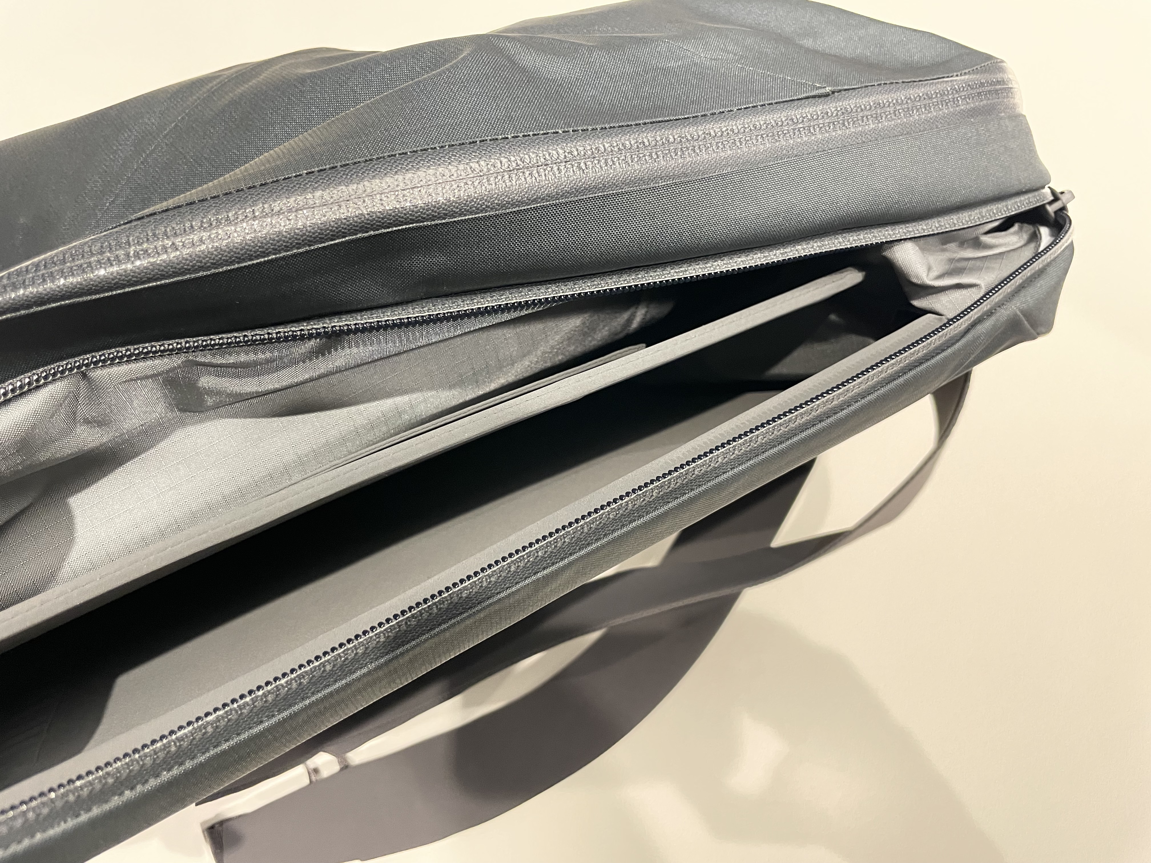
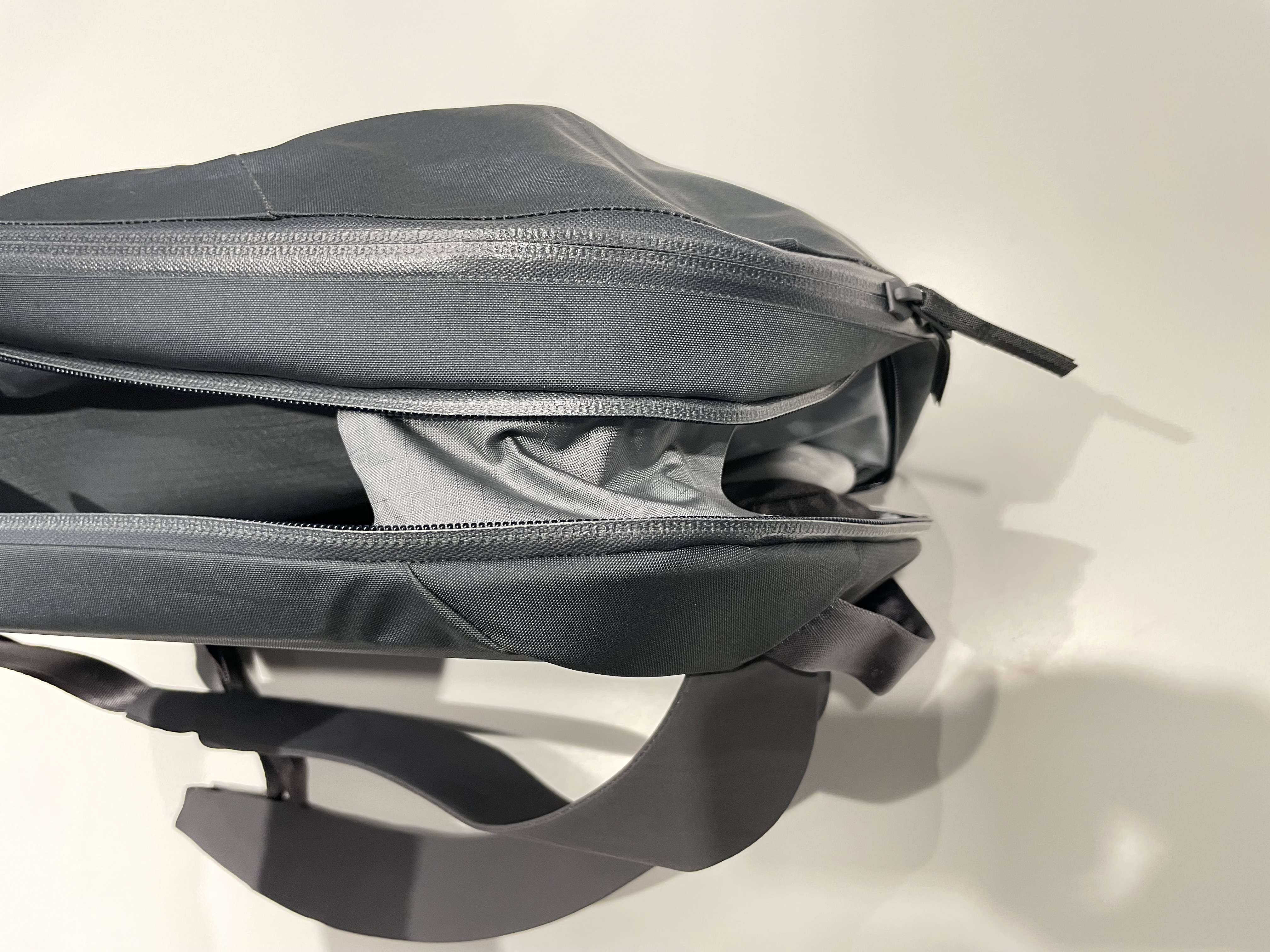
You can see above that the pocket has some pieces built into it to - I assume - prevent things from falling out, but it’s not really working. So, what I ended up doing is parking the two zipper pulls on the corners - like in the picture above - and using one or the other independently. That’s the reality of this pack: in trying to get a very sleek design some functionality was lost.
The back panel of the pack is completely bare. There is no padding, no grooves to prevent sweating, or anything. It’s just the same material as the entire bag. It’s ok, but since the back is very hard due to the frame sheet that protects the laptop I think in the summer, when I don’t wear jackets, it’d probably be a bit uncomfortable. We will see.
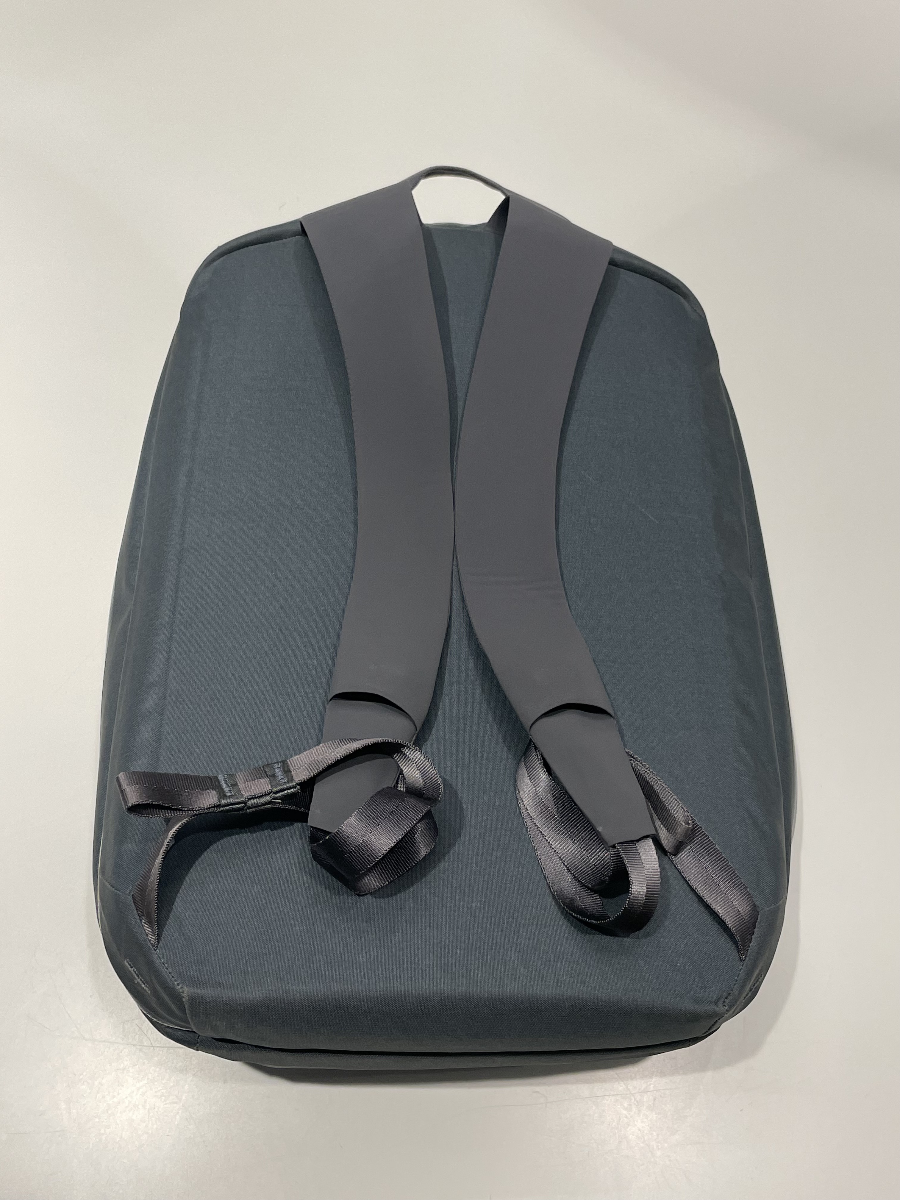
The straps are awesome. I was worried that they were going to be uncomfortable, but their design is spot on. Veilance used the technology and materials found on Arc'teryx climbing harnesses and they created thin, pliable, and very comfortable straps. They are a bit hard to adjust due to the adjustment hardware being hidden inside the straps material, but I found a way to do it relatively fast. Another functionality lost to design decisions. In this case I think it’s ok since most of the time you don’t need to adjust the straps.
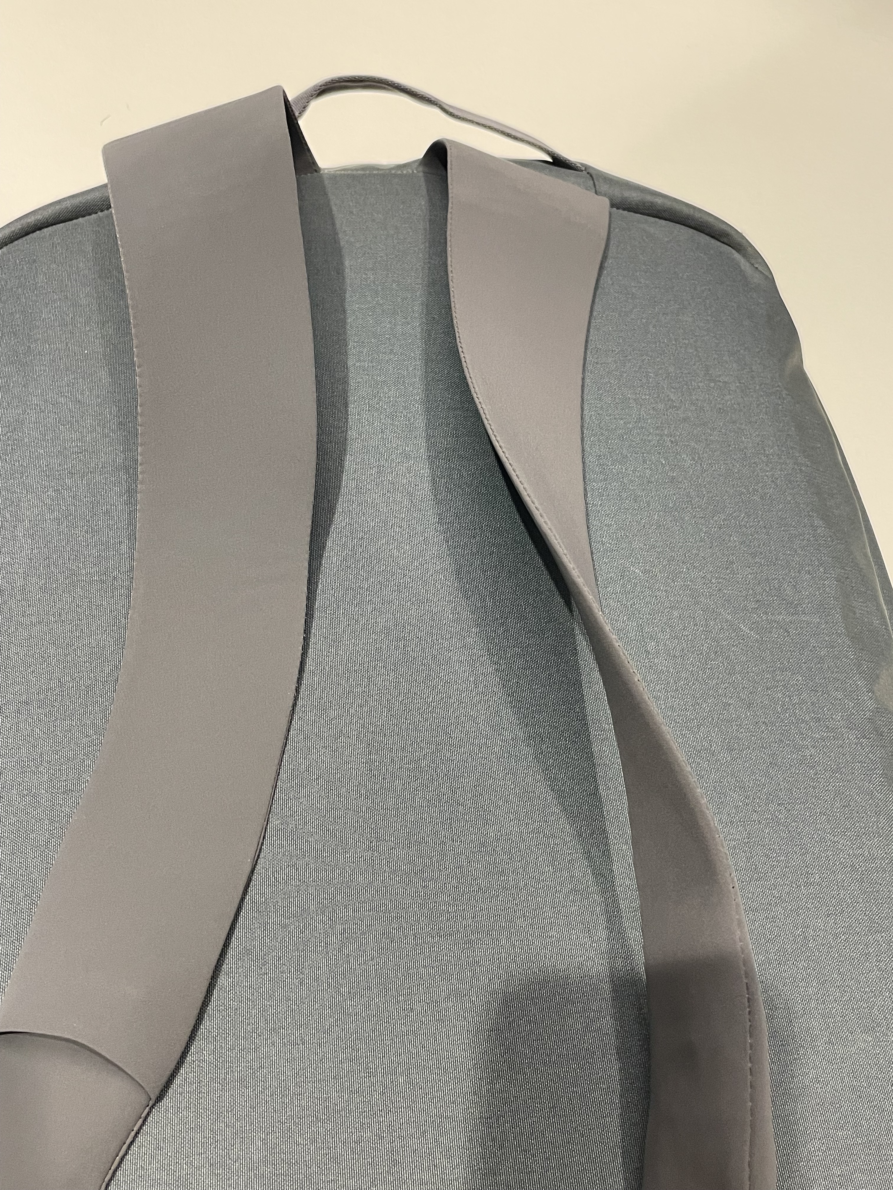
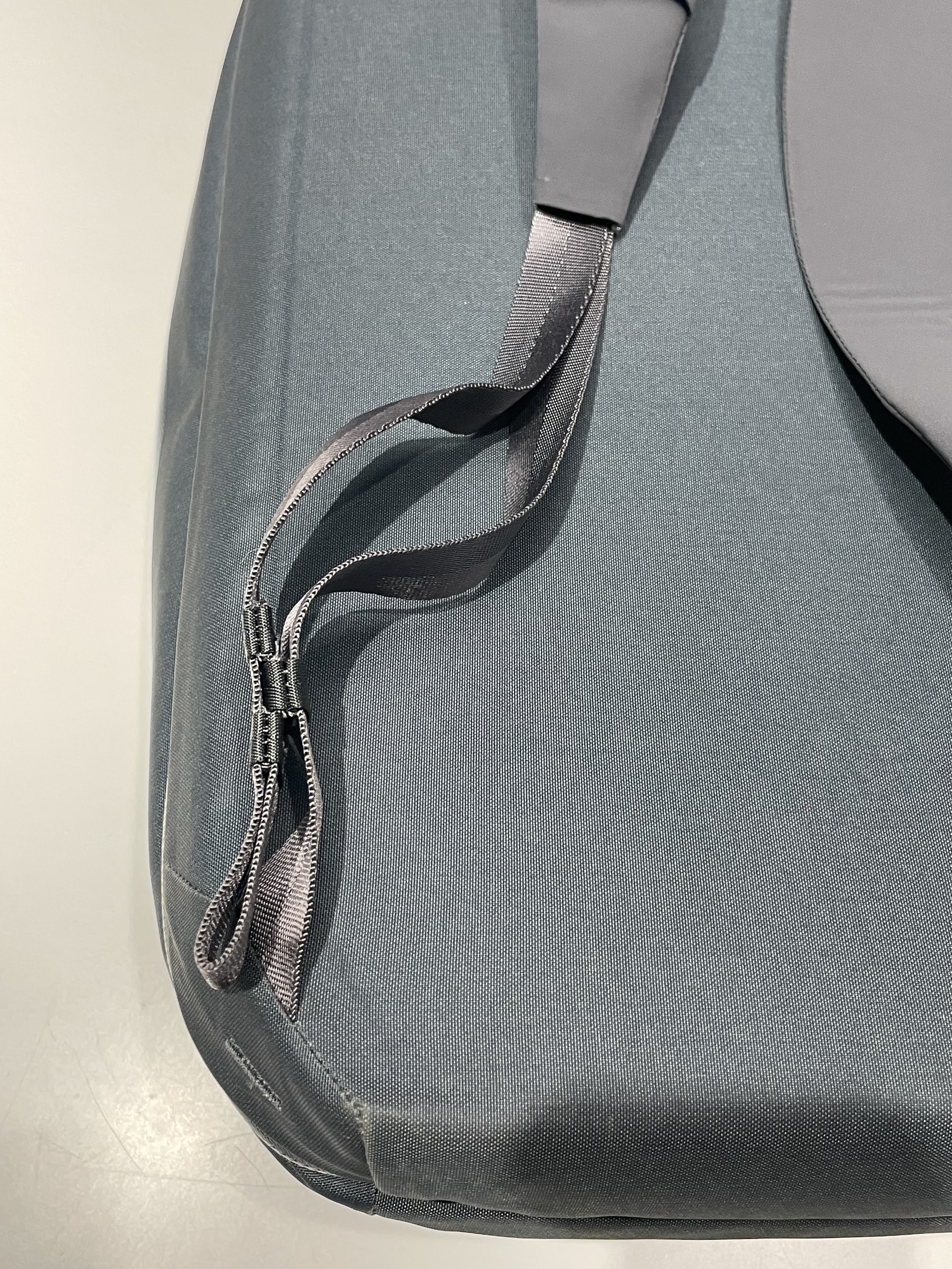
One huge plus, and thank you Veilance for doing it, is the strap management. One of the biggest issues I had with the Granville, and any backpack for that matter, is the straps hanging loose. Veilance added a good overall strap management. A big plus in my book.
Now into the interior. There is one big space for all. One big main compartment for everything and it’s big. It swallows your stuff. There is one pocket with a keychain for keeping smaller items, but that’s it.
The lid has no padding or anything protecting your stuff, so you need pouches both for organization and for protection if you have things that can break. I think this was a bit of an extreme minimalism design decision, but I can adapt. It does force you to really select the things you want to bring, and after two weeks of use, I found it refreshing to have this simplicity. However, again, there is no protection for your stuff, except from the elements. The seams are taped making this pack very weather resistant. Kudos for that!
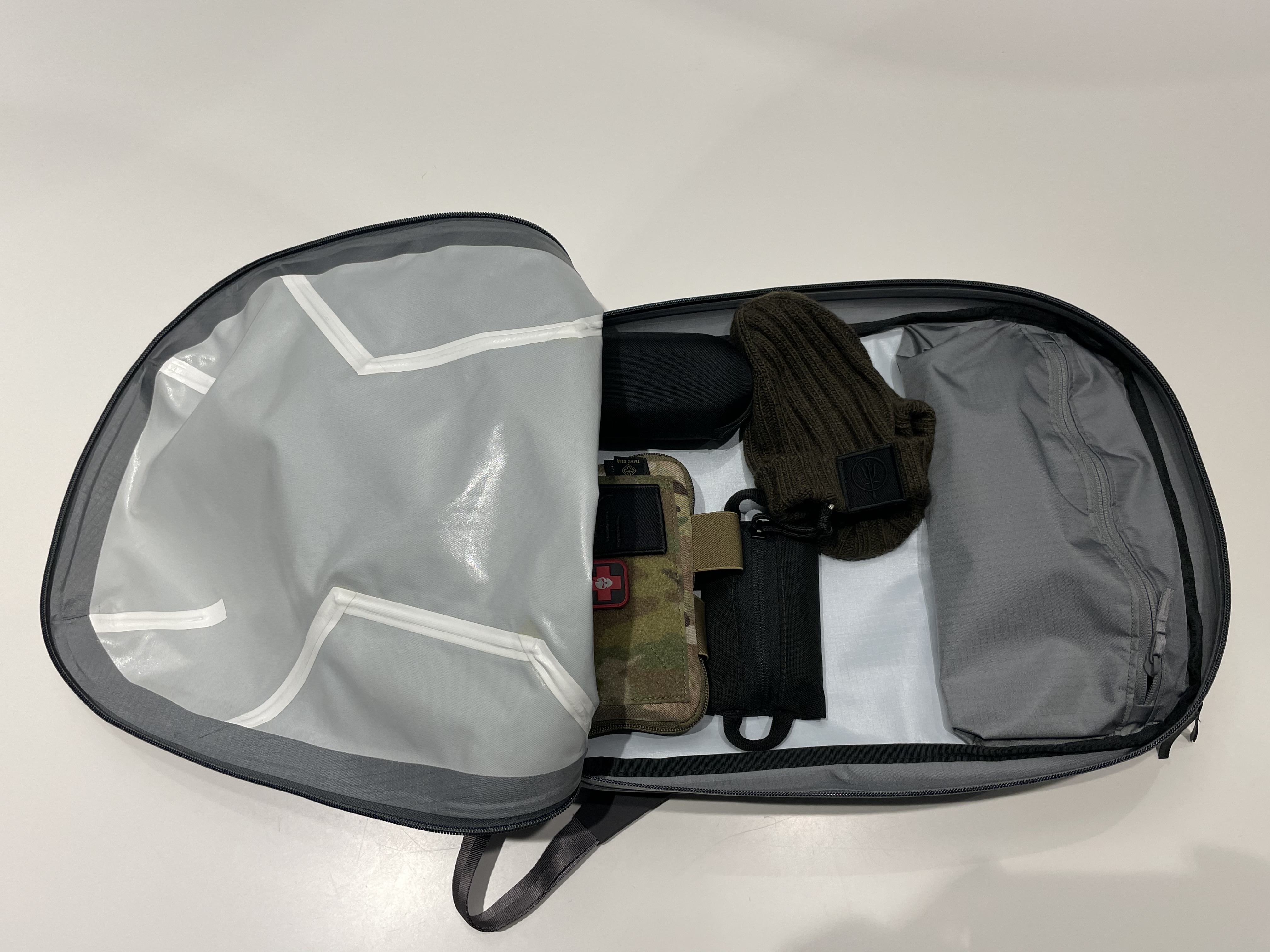
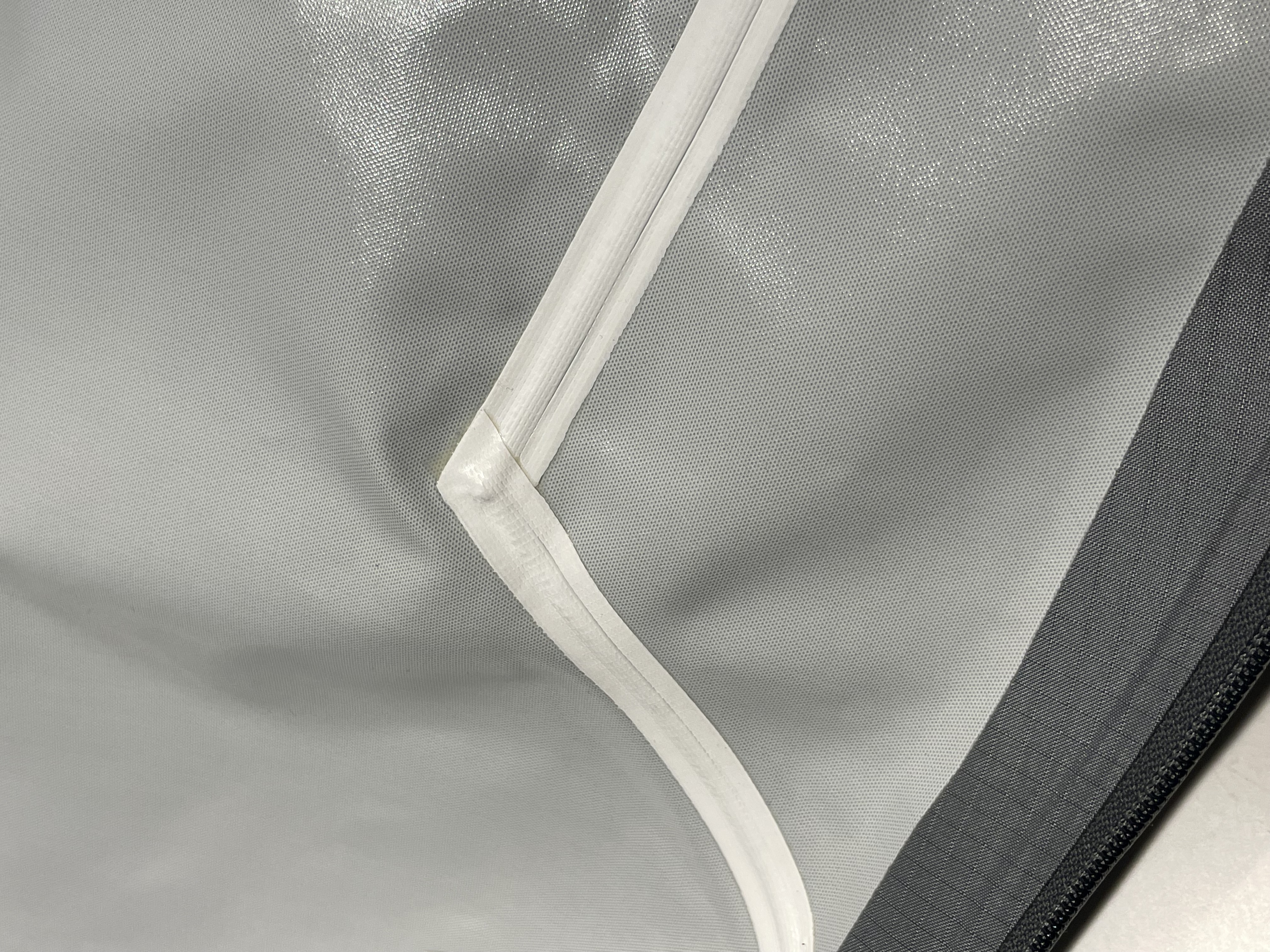
Organization, as mentioned before, is sparse. You will need to plan accordingly.
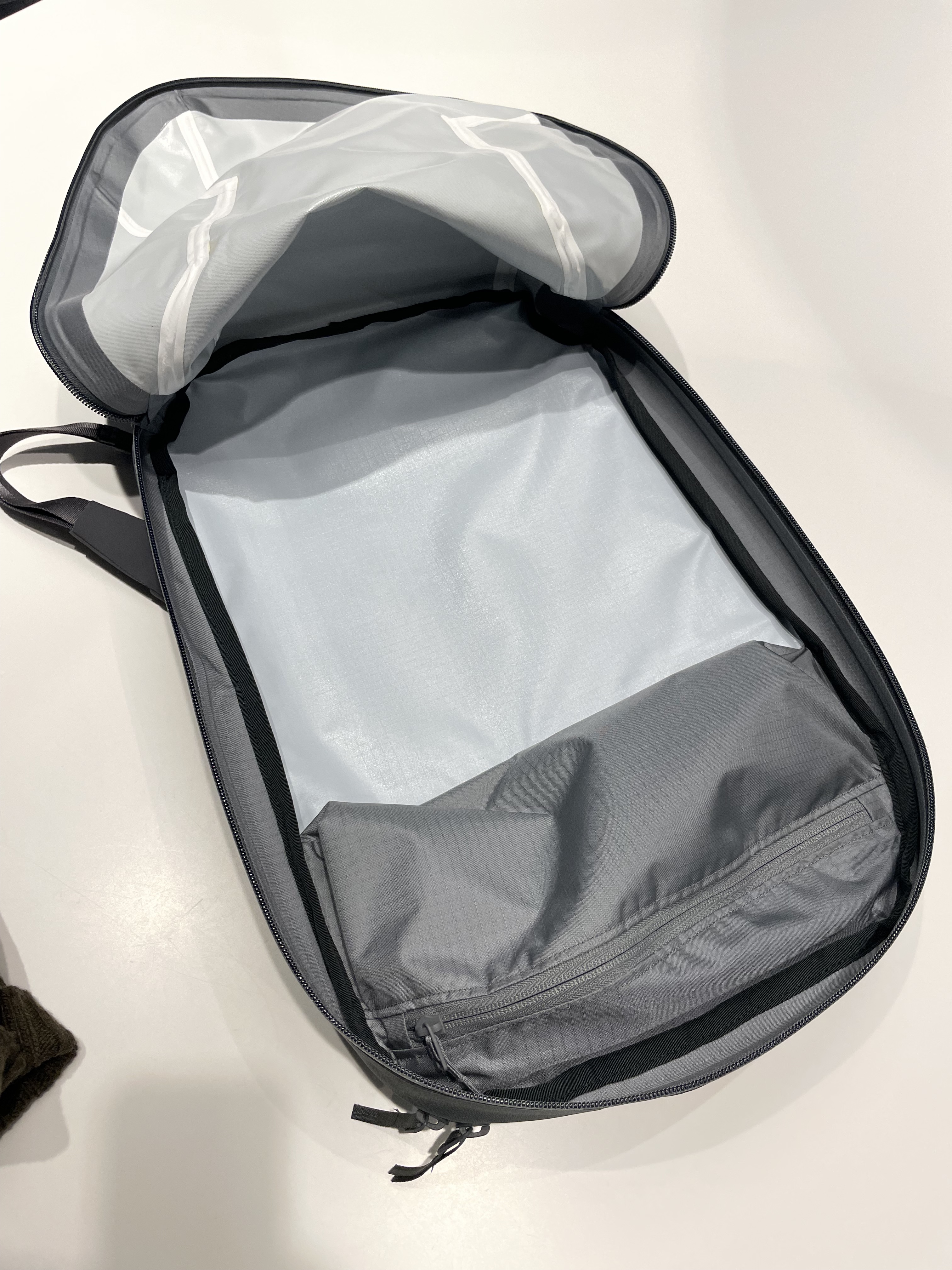
Overall I like this backpack. I’m not yet convinced 100% that this is a pack I want to use every day, which is a problem given the price tag ($800 in the US), but overall I am impressed with it. I do like the overall design and the idea behind the backpack, however there are some design decisions that I would have made different.
High quality materials used, check. Low-vis and unassuming, check. Comfortable and light, check. It does tick all of my boxes for a backpack, but there is something that nags me... We will see in a few months after I use it more.
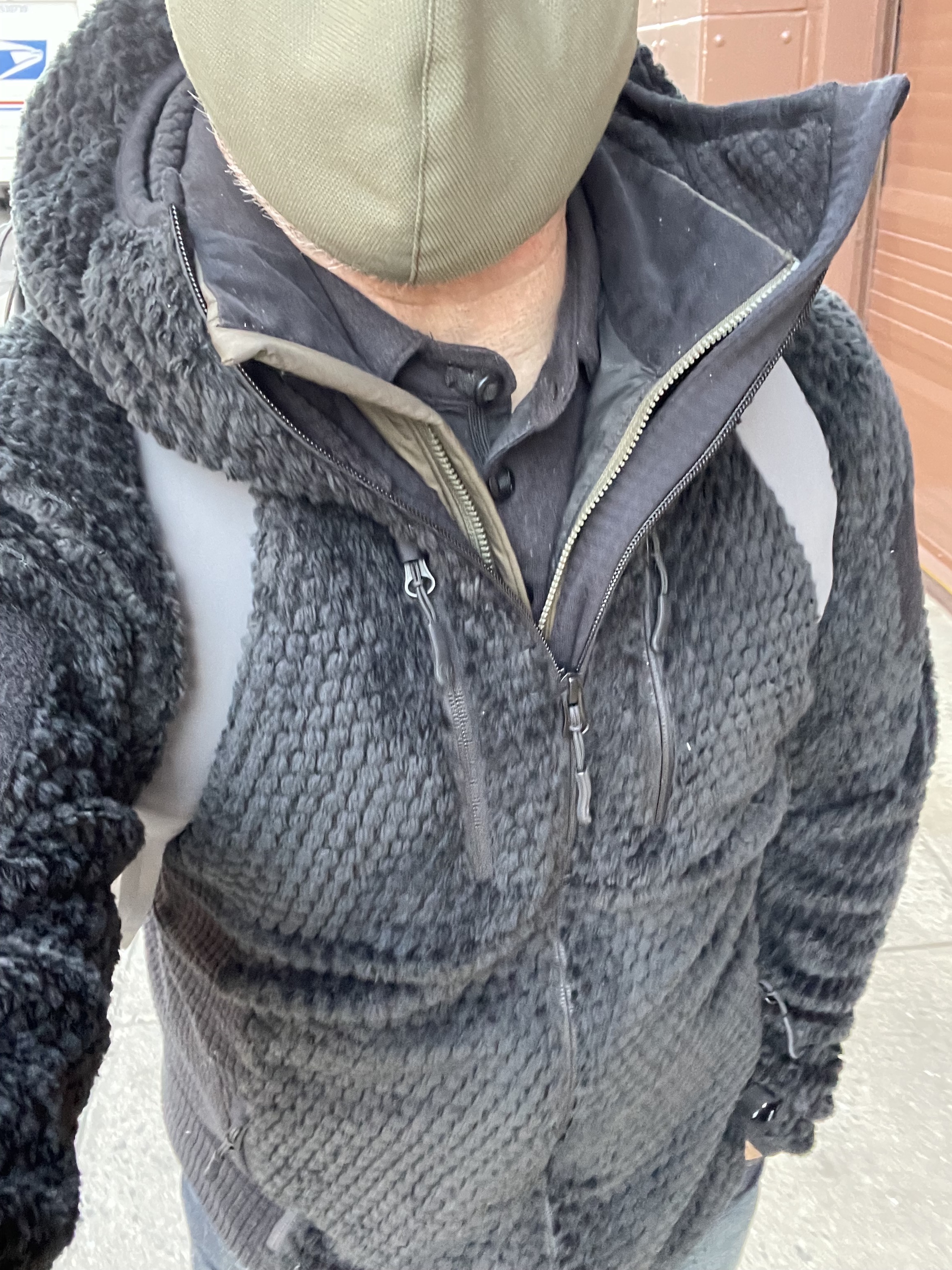
And since I know at least five readers will ask me about what I wear in the picture above, here:
- Thrudark Phalanx Fleece
- Arc'teryx Atom LT Vest
- Triple Aught Design Sector Polo
- Patagonia Denims